
티스토리 뷰
[출처] http://www.beansoftware.com/asp.net-tutorials/listview-datapager.aspx
ASP. NET 3.5 에서 ListView 와 DataPager라는 두개의 새로운 데이터 바운드 컨트롤을 도입했다. ListView 웹서버 컨트롤은 데이터 소스의 데이터를 보여주는것을 가능케하고DataPager를 붙이면페이징이 가능해진다.
ListView 는 DataList 와 DataRepeater 와 비슷하지만 수정,입력,삭제,바운드된 정렬(그리드뷰 컨트롤 데이터에서의와 같은)을 제공한다. GridView 컨트롤과는 다르게 ListView 는 페이지의 렌터링을 넘어선 전체 설정을 제공한다. 필요하면 템플릿과 스타일들을(CSS) 사용하여 깨끗한 HTML UI 를 제공할 수 있다.
DataPager 웹컨트롤은 페이지 데이터와 데이터바운드 컨트롤들을 위한 IPageableItemContainer 인터페이스를 구현하는 항해컨트롤을 보이는데 사용되어진다. ListView 는IPageableItemContainer를 구현하고 DataPager 에 페이징을 제공하는데 사용될것이다.
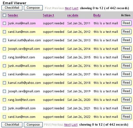
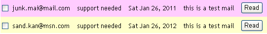
이 강좌에서는 두가지 컨트롤을 사용하여 아래 이미지와 같은 메일뷰어를 구현해볼것이다.
ListView를 DataSource에 묶기.
We can use any ASP.NET datasource control to bind to the ListView control by setting the DataSourceID property of the ListView control to the name of the Datasource control.
This sample is using AccessDataSource control to bind to the ListView control.
<asp:ListView ID="ListView1" DataSourceID="AccessDataSource1" runat="server" OnSorting="ListView1Sorting"
DataKeyNames="id" onitemcommand="ItemUpdate" >
ListView provides built in support for sort functionality. It has a sort event, which can be specified by setting the commandName property of the control, which is part of the ListView control to the 'Sort'. The Sort event supports command argument which can be used to identify which control raised the sort event. The handler for sort event is registered by setting the OnSorting property of the ListView to the handler name.
컨트롤들에 정렬 이벤트 명시
<asp:LinkButton runat="server" ID="LinkButton5" Text="Body" CommandName="Sort"CommandArgument="Body" />
정렬 이벤트 처리
protected void ListView1Sorting(Object sender, ListViewSortEventArgs e)
{
String strImage;
if (e.SortDirection == SortDirection.Ascending)
strImage = "asc.gif";
else
strImage = "desc.gif";
Image sortSender = (Image)ListView1.FindControl("Image1");
Image sortSubject = (Image)ListView1.FindControl("Image2");
Image sortRecdate = (Image)ListView1.FindControl("Image3");
Image sortBody = (Image)ListView1.FindControl("Image4");
if (e.SortExpression == "From")
{
sortSender.ImageUrl = strImage;
sortSender.Visible = true;
sortSubject.Visible = false;
sortRecdate.Visible = false;
sortBody.Visible = false;
}
else if (e.SortExpression == "Subject")
{
sortSubject.ImageUrl = strImage;
sortSender.Visible = false;
sortSubject.Visible = true;
sortRecdate.Visible = false;
sortBody.Visible = false;
}
else if (e.SortExpression == "recdate")
{
sortBody.ImageUrl = strImage;
sortSender.Visible = false;
sortSubject.Visible = false;
sortRecdate.Visible = true;
sortBody.Visible = false;
}
else if (e.SortExpression == "Body")
{
sortBody.ImageUrl = strImage;
sortSender.Visible = false;
sortSubject.Visible = false;
sortRecdate.Visible = false;
sortBody.Visible = true;
}
else
{
sortSender.Visible = false;
sortSubject.Visible = false;
sortRecdate.Visible = false;
sortBody.Visible = false;
}
}
ListView 템플릿 명시
ListView provides various templates which we can use to display the data. The templates are:
- LayoutTemplate
- ItemTemplate
- ItemSeparatorTemplate
- GroupTemplate
- GroupSeparatorTemplate
- EmptyItemTemplate
- EmptyDataTemplate
- SelectedItemTemplate
- AlternatingItemTemplate
- EditItemTemplate
- InsertItemTemplate
The display hierarchy of the various templates in ListView are shown below.
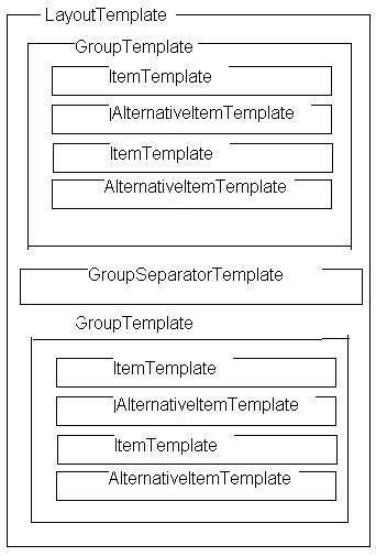
The main layout of a ListView control is created by defining a LayoutTemplate. The LayoutTemplate will include controls that acts as a placeholder for the data like Table, Panel, Label or HTML controls like table, div, or span elements that have a runat attribute set to "server".
Item template is the main template which will show the data bounded to the ListView in a repeated manner. This template typically contains controls that are data-bound to data columns or other individual data elements. These two templates are mandatory.
GroupTemplate will be used to group the items. The EditItemtemplate, SelectedItemTemplate, InsertItemTemplate are shown at that particular operation like insert, edit, select. ItemSeparatorTemplate, GroupSeparatorTemplate are used to separate the individual items and group Items Separately.
We will use each template to embed the necessary HTML controls like table, tr, td, div, span or server controls to display the UI according to our needs.
The following example shows the basic structure of a ListView with mandatory templates...
<asp:ListView runat="server" ID="ListView1"
DataSourceID="SqlDataSource1">
<LayoutTemplate>
<table runat="server" id="table1" runat="server" >
<tr runat="server" id="itemPlaceholder" ></tr>
</table>
</LayoutTemplate>
<ItemTemplate>
<tr runat="server>
<td id="Td1" runat="server">
<%-- Data-bound content. --%>
<asp:Label ID="NameLabel" runat="server"
Text='<%#Eval("Name") %>' />
</td>
</tr>
</ItemTemplate>
</asp:ListView>
An item placeholder must be specified on ListView. It will be specified in LayoutTemplate or GroupTemplate.
In order to specify a item placeholder set a control's ID property to "itemPlaceholder". The item placeholder control must also specify runat="server". If you want to provide a different ID, you can specify it using the ItemPlaceholderID attribute of the ListView control.
If Grouping is used, GroupTemplate will act as place holder for ItemTemplate. In this case a Groupplaceholder must be specified in ListView. An Groupplaceholder can be specified in LayoutTemplate by setting a control's ID property to "groupPlaceholder" or setting the GroupPlaceholderID attribute of the ListView control to a control which is specified in LayoutTemplate.
"itemPlaceholder", "groupPlaceholder" 에 컨트롤 ID 속성 설정하는 예제
<asp:ListView runat="server" ID="ListView1"
DataSourceID="SqlDataSource1"
GroupItemCount="5">
<LayoutTemplate>
<table runat="server" id="table1">
<tr runat="server" id="groupPlaceholder" >
</tr>
</table>
</LayoutTemplate>
<GroupTemplate>
<tr runat="server" id="tableRow">
<td runat="server" id="itemPlaceholder" />
</tr>
</GroupTemplate>
<ItemTemplate>
<td id="Td1" runat="server">
<%-- Data-bound content. --%>
<asp:Label ID="NameLabel" runat="server"
Text='<%#Eval("Name") %>' />
</td>
</ItemTemplate>
</asp:ListView>
컨트롤 ID들에 itemPlaceholderID, groupPlaceholderID 속성 설정 예제.
<asp:ListView runat="server" ID="ListView1"
DataSourceID="SqlDataSource1"
GroupItemCount="5" GroupPlaceholderID="Placeholder1" ItemPlaceholderID="Placeholder2">
<LayoutTemplate>
<table runat="server" id="table1">
<tr runat="server" id="Placeholder1">
</tr>
</table>
</LayoutTemplate>
<GroupTemplate>
<tr runat="server" id="tableRow">
<td runat="server" id="Placeholder2" />
</tr>
</GroupTemplate>
<ItemTemplate>
<td id="Td1" runat="server">
<%-- Data-bound content. --%>
<asp:Label ID="NameLabel" runat="server"
Text='<%#Eval("Name") %>' />
</td>
</ItemTemplate>
</asp:ListView>
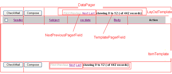
메일뷰어에 대한 LayoutTemplate 준비
We need to create the LayoutTemplate as shown below using the necessary HTML controls like table, tr, td (with styles) for formatting and the ASP.Net Server Controls (Buttons, LinkButtons, DataPager) for displaying the Headers as well as footers. We need to use a itemplaceholder for displaying the items from data source.
<LayoutTemplate>
<table border="0" cellpadding="6" cellspacing="0">
<thead>
<tr>
<td>
<asp:CheckBox runat="server" ID="CheckBox1" CommandName="select" CommandArgument="id" />
</td>
<td>
<asp:LinkButton runat="server" ID="LinkButton2" Text="Sender" CommandName="Sort"CommandArgument="From" />
<asp:Image runat="server" ID="Image1" ImageUrl="asc.gif" Visible="false" />
</td>
<td>
<asp:LinkButton runat="server" ID="LinkButton3" Text="Subject" CommandName="Sort"CommandArgument="Subject" />
<asp:Image runat="server" ID="Image2" ImageUrl="desc.gif" Visible="false" />
</td>
<td>
<asp:LinkButton runat="server" ID="LinkButton4" Text="recdate" CommandName="Sort"CommandArgument="recdate" />
<asp:Image runat="server" ID="Image3" ImageUrl="asc.gif" Visible="false" />
</td>
<td>
<asp:LinkButton runat="server" ID="LinkButton5" Text="Body" CommandName="Sort"CommandArgument="Body" />
<asp:Image runat="server" ID="Image4" ImageUrl="desc.gif" Visible="false" />
</td>
<td>Action</td>
</tr>
</thead>
<tbody>
<tr id="ItemPlaceHolder" runat="server"/>
</tbody>
<tfoot>
<tr>
</tr>
</tfoot>
</table>
<table>
<tr>
<td align=left>
<asp:Button runat="server" ID="LinkButton1" CausesValidation="false"
Text="CheckMail" OnClick="ClearSorting" />
<asp:Button runat="server" ID="LinkButton8" CausesValidation="false" Text="Compose"
OnClick="ShowInsert" Visible="true" /><asp:Button runat="server" ID="insert"
CausesValidation="false" Text="Send" OnClick="HideInsert" Visible="false" />
</td>
<td align=right >
<asp:DataPager runat="server" ID="ItemDataPager" PageSize="12" PagedControlID="ListView1">
<Fields>
<asp:NextPreviousPagerField ButtonType="Link"
ShowFirstPageButton="true"
ShowPreviousPageButton="true"
ShowLastPageButton="true"
ShowNextPageButton ="true"/>
<asp:TemplatePagerField>
<PagerTemplate>
<b>
showing
<asp:Label runat="server" ID="CurrentPageLabel"
Text="<%# Container.StartRowIndex %>" />
to
<asp:Label runat="server" ID="TotalPagesLabel"
Text="<%# Container.StartRowIndex+Container.PageSize %>" />
( of
<asp:Label runat="server" ID="TotalItemsLabel"
Text="<%# Container.TotalRowCount%>" />
records)
<br />
</b>
</PagerTemplate>
</asp:TemplatePagerField>
</Fields>
</asp:DataPager>
</td>
</tr>
</table>
</LayoutTemplate>
DataPager 준비
The DataPager control is used to page data and to display navigation controls for data-bound controls that implement the IPageableItemContainer interface.
A DataPager control can be associated to the data-bound control by using the PagedControlID property. Alternatively, the DataPager control can be placed inside the data-bound control hierarchy.
DataPager control will display navigation controls by adding the pager fields to the control. DataPager supports following types of pager fields.
NextPreviousPagerField: Enables to navigate through pages one page at a time, or to jump to the first or last page. It shows first, prev, next, last buttons. The button type may be of Button, Image, LinkButton.
NumericPagerField: enables to navigate through pages by displaying page numbers on the datapager.
TemplatePagerField: we can create custom UI by using TemplatePagerField. We can use Labels, buttons, images to create custom UI as well as programmatic control of the DataPager.
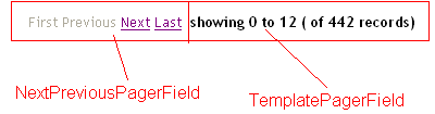
In order to create the DataPager according to the above image we need to use NumericPagerField as well as TemplatePagerField as part of the DataPager Fields. We can use DataPager control's properties like PageSize, TotalRowCount, StartRowIndex to create the TemplatePagerField.
PageSize gives the no of the pages currently displayed in DataPager.
TotalRowCount is the no of rows presented in the datasource attached to the DataPager.
StartRowIndex is the current first row's index in the data source .
<asp:DataPager runat="server" ID="ItemDataPager" PageSize="12" PagedControlID="ListView1">
<Fields>
<asp:NextPreviousPagerField ButtonType="Link"
ShowFirstPageButton="true"
ShowPreviousPageButton="true"
ShowLastPageButton="true"
ShowNextPageButton ="true"/>
<asp:TemplatePagerField>
<PagerTemplate>
<b>
showing
<asp:Label runat="server" ID="CurrentPageLabel"
Text="<%# Container.StartRowIndex %>" />
to
<asp:Label runat="server" ID="TotalPagesLabel"
Text="<%# Container.StartRowIndex+Container.PageSize %>" />
( of
<asp:Label runat="server" ID="TotalItemsLabel"
Text="<%# Container.TotalRowCount%>" />
records)
<br />
</b>
</PagerTemplate>
</asp:TemplatePagerField>
</Fields>
</asp:DataPager>
Preparing 항목 템플릿과 ItemTemplate 대안 준비
We need to embed the necessary HTML tags as well as Server controls like checkboxes, labels, buttons in order to get the following look for the ItemTemplates as well as AlternativeItemTemplates. The data will be bounded to the properties of the control's by using inline ASP.Net code <%#Eval("datafieldname")%>, where datafiledname is the column name in the datasoure.
<ItemTemplate>
<tr title="Tooltip text goes here!"
onmouseover="this.style.backgroundColor='#FFCCFF'" onmouseout="this.style.backgroundColor='#FFFFFF'">
<td>
<asp:CheckBox ID="ID" runat="server" />
</td><td>
<asp:Label ID="lbFrom" runat="server"> <%#Eval("From")%> </asp:Label>
</td><td>
<asp:Label ID="lbSubject" runat="server"><%#Eval("Subject")%></asp:Label>
</td><td>
<asp:Label ID="lbrecdate" runat="server"><%#Eval("recdate")%></asp:Label>
</td><td>
<asp:Label ID="lbBody" runat="server"><%#Eval("Body")%></asp:Label>
</td><td>
<asp:Button ID="EditButton" runat="Server" Text="Read" CommandName="Edit" />
</td></tr>
</ItemTemplate>
EditItemTemplate & InsertItemTemplate 준비
Similarly we can create EditItemTemplate as well as InsertItemTemplate, but instead of labels we will use TextBoxes like below.

<EditItemTemplate>
<tr><td>
<asp:TextBox ID="tbFrom" runat="server" Enabled="false" Text='<%#Bind("From")%>' />
</td><td>
<asp:TextBox ID="tbSubject" runat="server" Enabled="false" Text='<%#Bind("Subject")%>' />
</td><td>
<asp:TextBox ID="tbrecdate" runat="server" Enabled="false" Text='<%#Bind("recdate")%>' />
</td><td>
<asp:TextBox ID="tbBody" runat="server" Enabled="false" Text='<%#Bind("Body")%>' />
</td><td>
<asp:Button ID="DeleteButton" runat="Server" Text="Delete" CommandName="Delete" />
</td></tr>
</EditItemTemplate>

<InsertItemTemplate>
<tr><td>
<asp:TextBox ID="tbFrom" runat="server" Enabled="true" Text='<%#Bind("From")%>' />
</td><td>
<asp:TextBox ID="tbSubject" runat="server" Enabled="true" Text='<%#Bind("subject")%>' />
</td><td>
<asp:TextBox ID="tbrecdate" runat="server" Enabled="false" Text='<%#Bind("recdate")%>' />
</td><td>
<asp:TextBox ID="tbBody" runat="server" Enabled="true" Text='<%#Bind("Body")%>' />
</td><td>
<asp:Button ID="InsertButton" runat="Server" Text="Send" CommandName="Insert" />
</td></tr>
</InsertItemTemplate>
마무리
DataPager는 몇가지 시나리오에서 훌륭하지만 더 나아져야한다. DataPager는 항상 완전한 데이터소스 선택자로 사용되는것처럼 보인다 (단지 ListView의 데이터소스로만 사용된다). That is not efficient, even not acceptable if you have more than 100 pages. In that case it is better to select only page you want to show, instead of selecting all rows from large table. Also, DataPager works only with ListView. It cannot use Repeater or DataList. If you need more professional pager control which works with GridView, Repeater, ListView, DataList and every other control, use optimized paging with stored procedures, alphabetic, tags or even features like vertical or roman numbers paging you can get SEO Pager Control, the best software in this category.
이 강좌는 RELIANCE CONSULTING 에 의해 쓰여짐.
'웹프로그래밍 > .NET' 카테고리의 다른 글
| Visual Studio 2010 과 .NET Framework 4 훈련과정 (0) | 2010.06.24 |
|---|---|
| [ASP.NET] 콧수염아저씨와 함께 배워보는 ListView 컨트롤 (0) | 2010.06.14 |
| ASP.NET에서 게시판 디자인 받아서 ASP 또는 PHP 같이 작업하려면? (0) | 2010.01.03 |
| [C#] 정렬 (0) | 2008.11.18 |
| C# Prepared Statements (0) | 2008.11.09 |
- Total
- Today
- Yesterday
- iis
- sencha touch
- 안드로이드
- CSS
- Android
- Mac
- nodejs
- PHP
- 워드프레스
- nginx
- iphone
- laravel
- IE
- javascript
- Docker
- macos
- IOS
- classic asp
- API
- ASP
- centos
- JQuery
- Debug
- JSON
- mssql
- git
- Linux
- Wordpress
- Prototype
- 한글
| 일 | 월 | 화 | 수 | 목 | 금 | 토 |
|---|---|---|---|---|---|---|
| 1 | 2 | 3 | 4 | |||
| 5 | 6 | 7 | 8 | 9 | 10 | 11 |
| 12 | 13 | 14 | 15 | 16 | 17 | 18 |
| 19 | 20 | 21 | 22 | 23 | 24 | 25 |
| 26 | 27 | 28 | 29 | 30 | 31 |